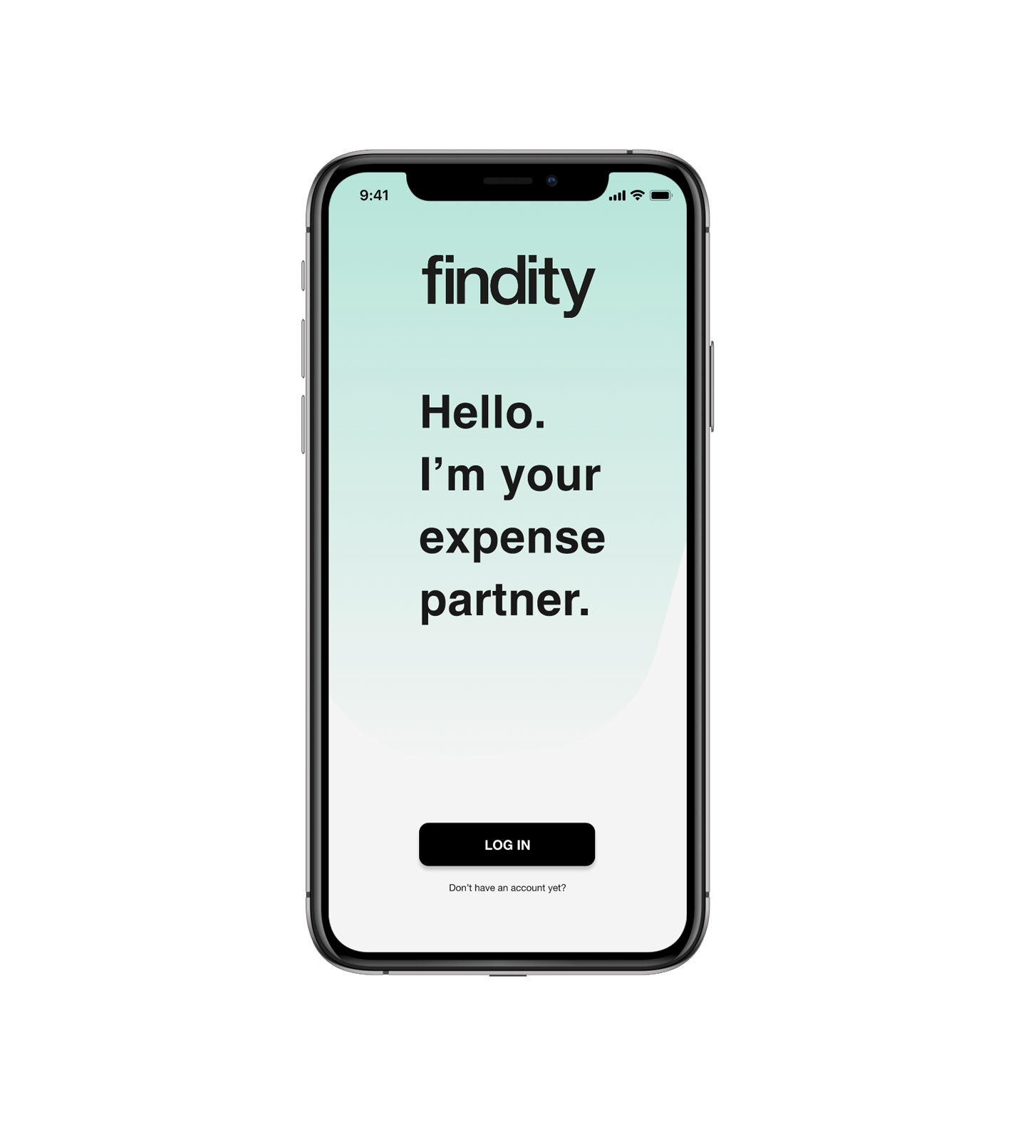
CLIENT Findity, an expense management app for digitizing company invoices launched in 2015.
GOAL Simplify the experience for the employees by optimizing the user flow in the app.
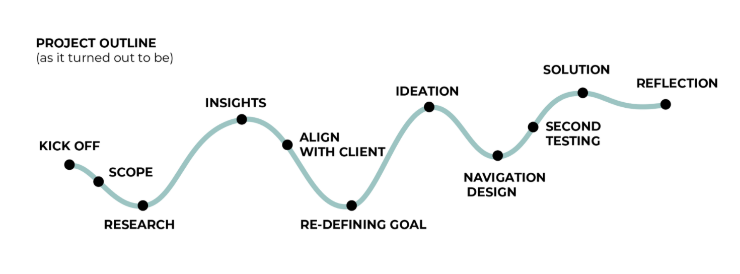
TIME 3 weeks
MY ROLE
Conducting user research Redesigning the user flow Low- fi prototyping
Conducting Usability tests
Presenting and storytelling
THE TEAM
1 Project manager
1 Strategist
2 UX designers - I´m one of those!
1 UI designer
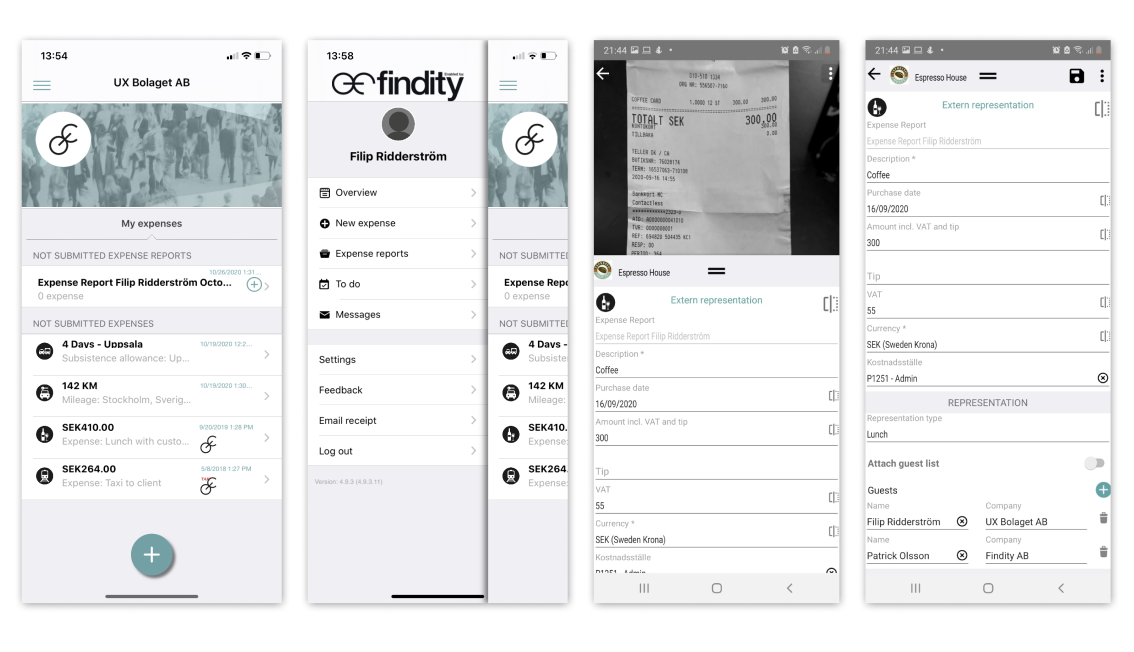
HOW FINDITY WORKS
Obtaining reimbursement for business representation expenses is a tedious and time-consuming task. Findity facilitates the process, by digitizing receipts, tracking subsistence allowance and milage, and connecting employees with the accounting area.
CURRENT FLOW
1. Create an expense/subsistence allowance /milage (the new expense feature has an AI auto-filling function of the form)
2. Complete/ check the information.
3. Save/add the expense to a report
4. Send report.
FIRST ROUND OF USABILITY TESTING
& INTERVIEWS
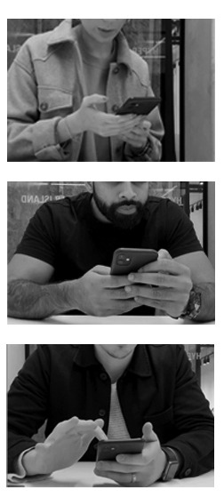
We interviewed five people, we asked them to perform the most common function, upload a receipt.
My role was to design and lead the research, which meant identifying what we wanted to know, create a screener for recruitment and write interview questions.
QUOTES FROM THE USERS:
"The landing page doesn´t look like a landing page"
"I have to search to find the menu"
"I don´t know where in the process I´m at!"
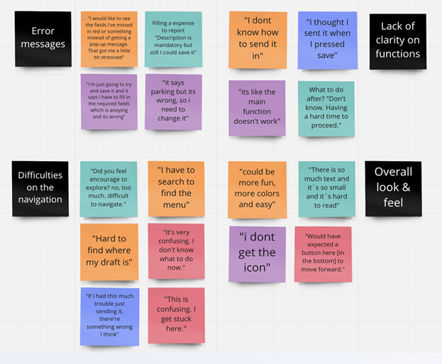
COLLECT INSIGHTS
We gathered our insights in an affinity diagram. We found three major issues in the first round of interviews:
- The users were overwhelmed by the amount of information and the lack of structure on the landing page.
- The general navigation was difficult and the users couldn’t identify with clarity if they completed the action or not.
- Many steps and required fields didn't make sense to the users which led to a feeling of irritation and annoyance.
But also found things that users valued:
- The auto-filling function.
- To visualize what tasks were unfinished
PROTOTYPING & TESTING
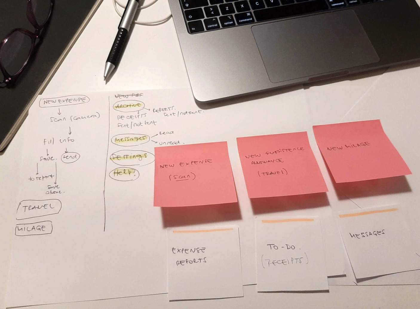
In preparation for our follow-up interviews, we created two quick prototypes. My role was to turn the ideas from the team into prototypes.
I sketched and did several iterations through fast and informal tests. This way we quickly learned what worked and what didn’t.
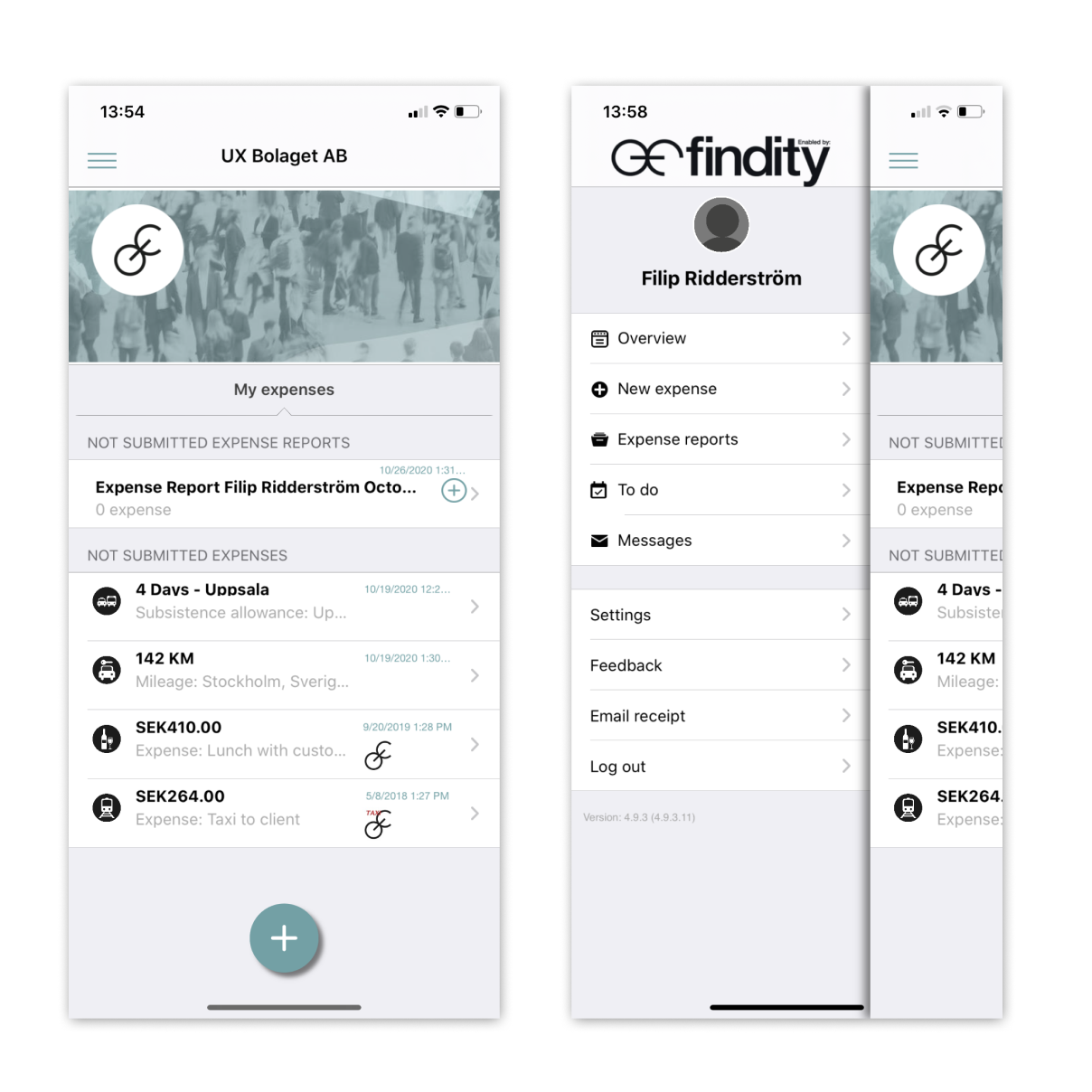
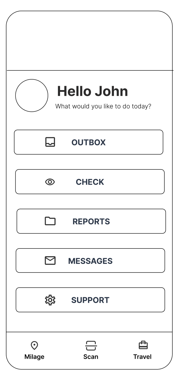
LANDING PAGE
The existing landing page was a mixture of a display of reports & receipts to be sent and two menus, one with the three main actions, and a hamburger menu with the rest of the features.
Unsent reports & Receipts
New expense - New subsistence allowance - New milage
Messages - Expense reports - settings
We removed all the menus to provide a clear overview of functions and used the "card sorting method" to build the landing page working on the structure and hierarchy of the information.
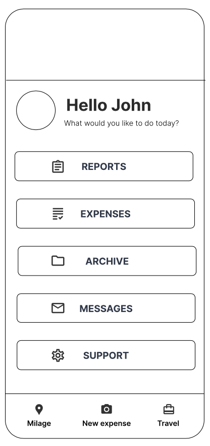
THREE CATEGORIES TO ORGANIZE THE FUNCTIONS
Quick actions New expense, New subsistence allowance & New milage. These main functions needed to be very accesible. We placed them at the bottom navigation bar and changed New subsistence allowance to "travel" & New milage to "Milage"
Unfinished processes We added Reports & Expenses at the top of the menu to be visible and accessible to complete the tasks and also function as a reminder to complete those actions.
Secondary features we grouped all the other features that are not urgent but necessary.
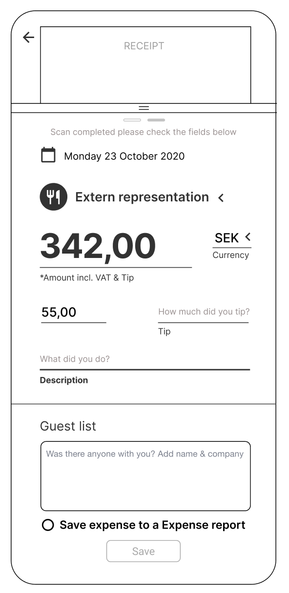
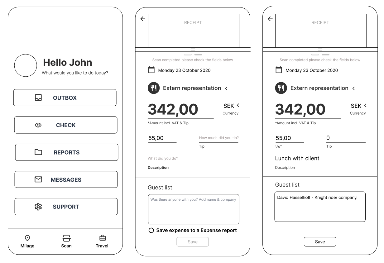
STREAMLINE THE FLOW OF UPLOADING A RECEIPT
For the flow "new expense" we worked closely with the client reviewing and ranking the displayed information. My role was to lead that meeting and sketch quickly prototypes to visualize and get aligned on the changes.
We gave hierarchy to the information by restructuring and grouping the similar fields.
We worked on the clarity of the process by adding text explaining what information is required on the empty fields.
The auto-scan function stayed as it was but we added a progress tracker so the user can see how many steps are left to finish the task.
This process helped us to get a better understanding of the porpoise of the information required and the client valued that we went into the details and challenged their preconceptions.
"I don´t know where to find the expense I just filled in! Is it in expenses or archive?"
"Mhhh, so to scan a receipt I go to "New expense"?
GATHERING INSIGHTS FROM THE SECOND ROUND OF INTERVIEWS
The new landing page and the flow of upload a receipt had a very good reception on the second testing session with the users. They easily understood the functions and got certainty on what to do and when tasks were finished. But still, there was room for improvement:
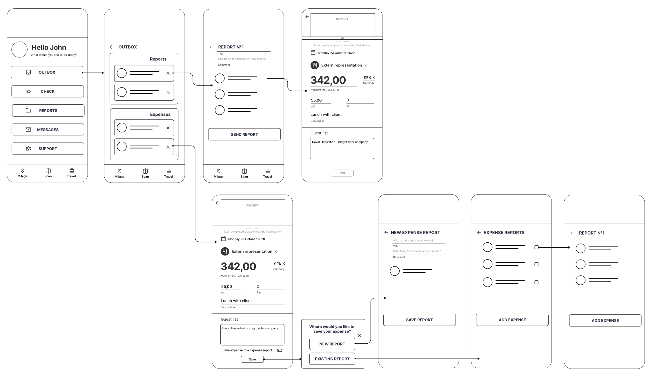
ACTIVATING THE SEND OF REPORTS & EXPENSES
Sense of urgency The users didn´t perceive that reports & expenses as ongoing processes or unfinished tasks.
Instead of having two different places to find the unsent reports & expenses, we implemented the outbox concept in one place to find the not sent reports & expenses. We also added the check instance to the landing page. The reports that are returned and need to be controlled will fall into that category providing the user quick access to it.
MORE PRECISE NAMES
Naming of the functions The New expense function on the navigation bar could be named in a way that is even more connected to the function.
The new expense is actually a scanning receipts function, we named it "Scan" so the user can easily connect the function with the icon.
AN IMPROVED EXPERIENCE
Before:
- Users landed on page of not submitted reports and expenses.
- To upload an expense they needed to search trough the menus the right function.
- To find any other function the user also needed to navigate through the menus.
- The fields on the New expense page were unclear and the users confuse saving an expense with adding it to a report.
After:
- Users can have an overview of all the functions on the landing page.
- There is a much clear distinction between on going processes, things that need to be sent (Outbox, Check) and the other functions
- Quick access to Milage, Scan & Travel.
- A much more clear process of uploading the information on the expense page.
- Better clarity when saving a expense alone or to a expense report.
NAVIGATION EXAMPLE
KEY LEARNINGS
CHOOSE YOUR CHALLENGE
This project was really interesting because I got the chance of experiencing many different UX processes. I enjoyed discovering the insights after the user interviews Due to the short amount of time given for this project it was an easy decision to work with first-time users. If I have to do it again I would like to research deeper on the different kinds of users to understand the impact of the decisions taken.
ITERATE, ITERATE, ITERATE!
It was key to build different MVPs and test and validate our ideas during the whole process. If I were to do it again, I would save time to test the final product with the final UI on a qualitative interview.
WORK CLOSE WITH THE CLIENT
Maintain fluent communication, update them about the progress, and get feedback on the go was everything in this high paced project. It helped us to keep the focus on solving meaningful problems and speed up decisions. For the next time, I would include those workshops and feedback sessions in the planning schedule.