MY ROLE
Art direction
Developing iconography
Market research
THE TEAM
Project manager
Account Manager
Art Director (me!)
Visual designer
Researcher
THE CONTEXT
Tinky is a multifunctional tool focused on optimizing preschool education. It combines organizational functions with educational content to create a platform/one-stop-shop that simplifies preschool teacher's everyday administrative chores and that is built to meet the requirements set out by Sweden´s government.
THE RESEARCH
After some desktop research on the market, it was clear that there were no similar products as Tinky. Other apps were either administrative or recreational, but no one combines both universes.
Also, preschool teachers were interviewed to understand the primary user needs and goals. It was clear that they are compelled to use the apps on their work, and they felt overwhelmed by them.
“The digital tool we use today are too complicated and I need more professional training in it.”
“My biggest challenge in my work space together with the kids is to make all the technical devices and the wifi work together”.
THE BRAND PILLARS
Based on the research we started defining the brand pillars and the brand promise with the intention of motivating teachers and balancing educational and administrative sides.
Playful - Clean - Creative - Friendly - Modern - Effective - Smart - Supportive - Including
THE BRAND PROMISE
Tinky helps you to organize, solve problems, and work as a gateway to creativity – all in a playful way. It is inclusive, offers educational content, and also inspires discovery.
THE LOGO
Tinky´s logo is a combination between the typography and a sign, allowing several combinations that can be applied depending on the context. This was done with the intention of using the sign as the app icon among other uses.
The logo mark shows the two different aspects of Tinky as a tool - organization and creativity. The combination of the left and right sides of the brain merges the rational with the imaginative in a playful way, shaping the cloud of imagination.
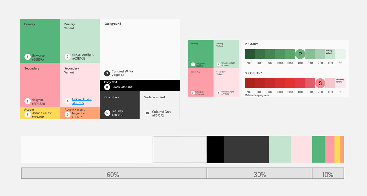
THE COLORS
Contrast and accessibility: Tinky aims to account for any special needs and to make sure that all design and typography are human, empathetic, and adapted to all ages and abilities we chose the font with those requirements in mind and we tested the color palette to ensure the accessibility.
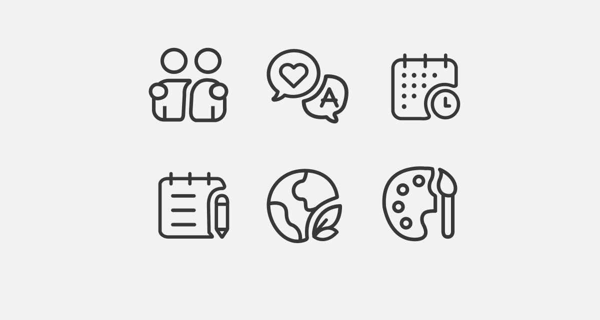
THE ICONOGRAPHY
Following the brand guidelines, the iconography proposal continues the rounded shapes and is composed of two elements that leave a blank space between each other. The primary implementation will be as theme indicators on both parts of the app.
THE DELIVERABLES
The brand development, applications, and guidelines were packaged on a brand book that included: Brand definition, brand pillars, tone of voice, logo, color scheme, iconography, illustration, and photography.
KEY LEARNINGS
This was a fun project! I really enjoyed working with this team and client. Although being the only graphic designer with a formal education it was challenging to perform the role of art director, my team was conformed with designers in other areas and people coming from other areas not related to design. I had to train my empathy and communication skills to get the message across to the team and move forward with the project.